TIMUIKitGroupProfile-Implementation
Introduction
The widget shows the group profile page.
Parameter details
| Parameter name | Parameter type | Required | Platform | Description |
|---|---|---|---|---|
| groupID | String | yes | All | The current Group ID. |
| backGroundColor | Color | no | All | The background color. |
| profileWidgetBuilder | GroupProfileWidgetBuilder | no | All | [If you tend to customize the profile page, use [profileWidgetBuilder] with [profileWidgetsOrder] as priority.] The builder for each widgets in profile page, you can customize some of it by pass your own widget into here. Or, you can add your custom widget to the three custom widgets. |
| profileWidgetsOrder | List< GroupProfileWidgetEnum > | no | All | [If you tend to customize the profile page, use [profileWidgetBuilder] with [profileWidgetsOrder] as priority.] If the default widget order can not meet you needs, you may change the order by this array with widget enum. |
| builder | GroupProfileBuilder | no | All | The builder for the whole group profile page, you can use this to customize all the element here. Mentioned: If you use this builder, [profileWidgetBuilder] and [profileWidgetsOrder] will no longer works. |
| lifeCycle | GroupProfileLifeCycle | no | All | The life cycle hooks for group profile business logic. You have better to implement the didLeaveGroup in it. |
| onClickUser | Function(String userID) | no | All | The callback after user clicking a user, you may navigating to the specific profile page, or anywhere you want. |
Code examples
builder
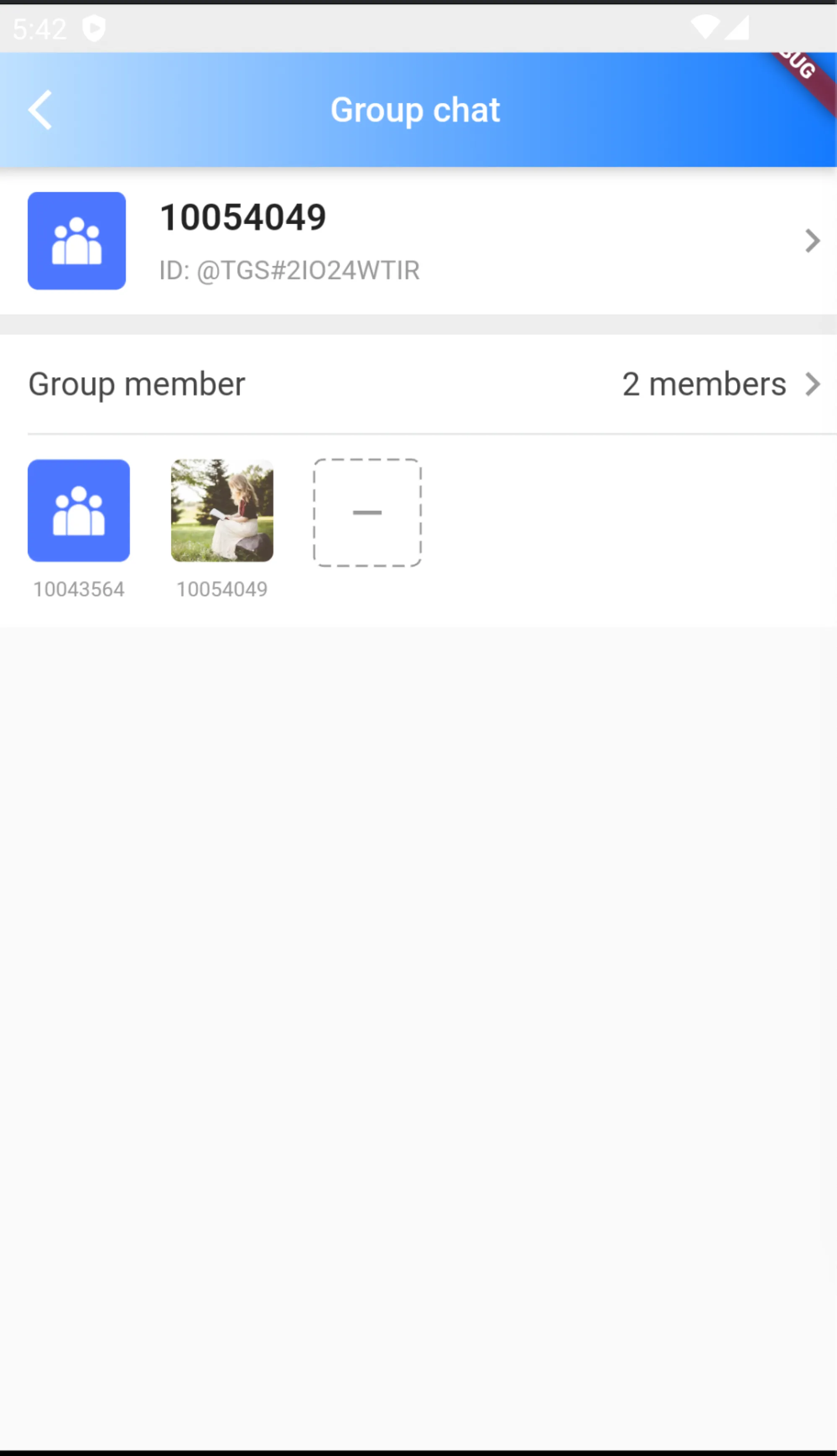
Builder is a builder used to customize the entire group information page.
If this property is used, profileWidgetBuilder and profileWidgetsOrder will become invalid.
The following example code shows to use builder to display only group information cards and group member information..

/// @title:"Builder is a builder used to customize the entire group information page."
/// @title:"If this property is used, profileWidgetBuilder and profileWidgetsOrder will become invalid."
/// @title:"The following example code shows to use builder to display only group information cards and group member information.."
/// @picture:"https://qcloudimg.tencent-cloud.cn/raw/a8dd7d3e991932b3c9e9e3fa621ccac2.jpg"
@override
Widget build(BuildContext context) {
  final theme = Provider.of<DefaultThemeData>(context).theme;
  return Scaffold(
      appBar: AppBar(
          title: Text(
            "Group chat",
            style: const TextStyle(color: Colors.white, fontSize: 17),
          ),
          shadowColor: Colors.white,
          flexibleSpace: Container(
            decoration: BoxDecoration(
              gradient: LinearGradient(colors: [
                theme.lightPrimaryColor ?? CommonColor.lightPrimaryColor,
                theme.primaryColor ?? CommonColor.primaryColor
              ]),
            ),
          ),
          iconTheme: const IconThemeData(
            color: Colors.white,
          )),
      body: SafeArea(
        child: TIMUIKitGroupProfile(
          lifeCycle: GroupProfileLifeCycle(didLeaveGroup: () async {
            Navigator.pushAndRemoveUntil(
                context,
                MaterialPageRoute(
                    builder: (context) => const HomePage(
                          pageIndex: 1,
                        )),
                (route) => false);
          }),
          groupID: groupID,
          builder: (context, groupInfo, groupMemberList) {
            return Column(
              children: [
                TIMUIKitGroupProfileWidget.detailCard(groupInfo: groupInfo),
                TIMUIKitGroupProfileWidget.operationDivider(),
                TIMUIKitGroupProfileWidget.memberTile()
              ],
            );
          },
        ),
      ));
}
lifeCycle
LifeCycle is the trigger hook function when the user's group information is operated.
The following example code shows to use didLeaveGroup to return to the contact page after leaving the group..

/// @title:"LifeCycle is the trigger hook function when the user's group information is operated."
/// @title:"The following example code shows to use didLeaveGroup to return to the contact page after leaving the group.."
/// @picture:"https://tuikit-1251787278.cos.ap-guangzhou.myqcloud.com/lifeCycle.gif"
@override
Widget build(BuildContext context) {
  final theme = Provider.of<DefaultThemeData>(context).theme;
  return Scaffold(
      appBar: AppBar(
          title: Text(
            "Group chat",
            style: const TextStyle(color: Colors.white, fontSize: 17),
          ),
          shadowColor: Colors.white,
          flexibleSpace: Container(
            decoration: BoxDecoration(
              gradient: LinearGradient(colors: [
                theme.lightPrimaryColor ?? CommonColor.lightPrimaryColor,
                theme.primaryColor ?? CommonColor.primaryColor
              ]),
            ),
          ),
          iconTheme: const IconThemeData(
            color: Colors.white,
          )),
      body: SafeArea(
        child: TIMUIKitGroupProfile(
          lifeCycle: GroupProfileLifeCycle(didLeaveGroup: () async {
            Navigator.pushAndRemoveUntil(
                context,
                MaterialPageRoute(
                    builder: (context) => const HomePage(
                          pageIndex: 1,
                        )),
                (route) => false);
          }),
          groupID: groupID,
          profileWidgetBuilder: GroupProfileWidgetBuilder(searchMessage: () {
            return TIMUIKitGroupProfileWidget.searchMessage(
                (V2TimConversation? conversation) {
              Navigator.push(
                  context,
                  MaterialPageRoute(
                      builder: (context) => Search(
                            onTapConversation: (V2TimConversation conversation,
                                V2TimMessage? targetMsg) {
                              Navigator.push(
                                  context,
                                  MaterialPageRoute(
                                    builder: (context) => Chat(
                                      selectedConversation: conversation,
                                      initFindingMsg: targetMsg,
                                    ),
                                  ));
                            },
                            conversation: conversation,
                          )));
            });
          }),
        ),
      ));
}
onClickUser
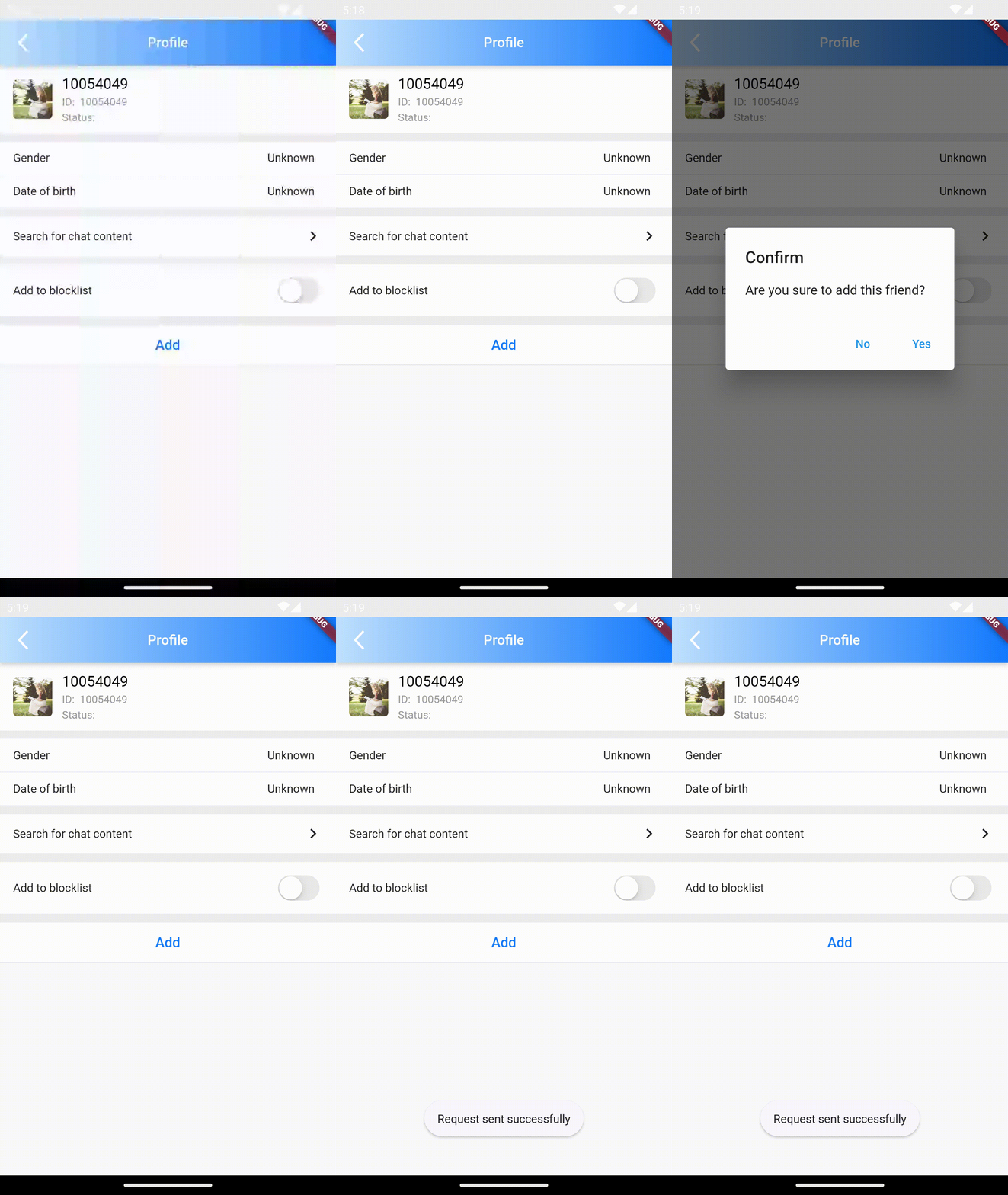
OnClickUser is the trigger callback function when clicking the group member module in the group member list.
The following example code shows to use onClickUser to enter the member user information page when the group member module is clicked..

/// @title:"OnClickUser is the trigger callback function when clicking the group member module in the group member list."
/// @title:"The following example code shows to use onClickUser to enter the member user information page when the group member module is clicked.."
/// @picture:"https://tuikit-1251787278.cos.ap-guangzhou.myqcloud.com/onClickUser.gif"
@override
Widget build(BuildContext context) {
  return Scaffold(
      body: SafeArea(
    child: TIMUIKitGroupProfile(
      groupID: groupID,
      onClickUser: (String userID) {
        Navigator.push(
            context,
            MaterialPageRoute(
              builder: (context) => UserProfile(userID: userID),
            ));
      },
    ),
  ));
}
profileWidgetBuilderAndprofileWidgetsOrder
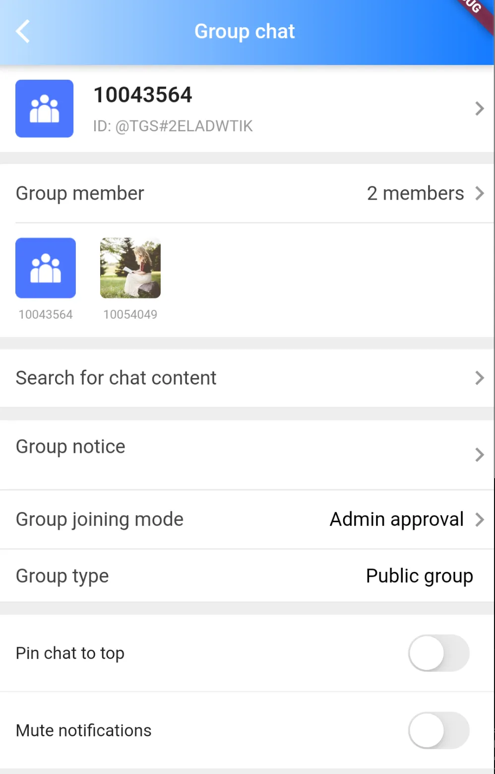
The profileWidgetsOrder determines the order of components in the profileWidgetBuilder in the page.
For example, when the profileWidgetsOrder is [GroupProfileWidgetEnum. detailCard, GroupProfileWidgetEnum. memberListTitle], the detailCard component will be above the memberListTitle component
The profileWidgetBuilder determines the rendering results of components with different names in the TIMUIKitGroupProfile..
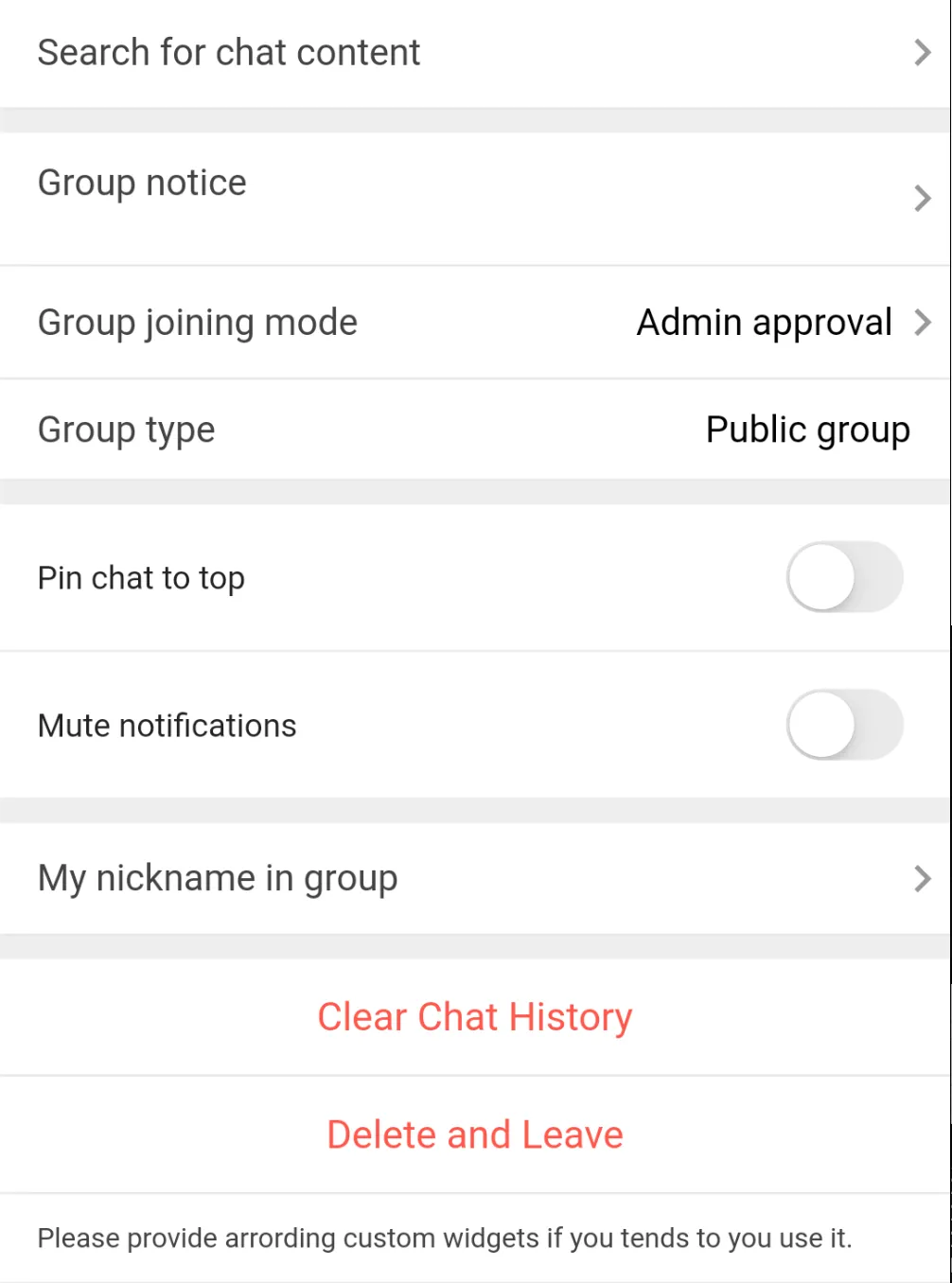
In profileWidgetBuilder, except searchBar and customBuilder (One-Five), other components have default components
The code example is an example of using custom searchBar and customBuilderOne. If you need to customize other components, add the component name in the profileWidgetBuilder property.


/// @title:"The profileWidgetsOrder determines the order of components in the profileWidgetBuilder in the page."
/// @title:"For example, when the profileWidgetsOrder is [GroupProfileWidgetEnum. detailCard, GroupProfileWidgetEnum. memberListTitle], the detailCard component will be above the memberListTitle component"
/// @title:"The profileWidgetBuilder determines the rendering results of components with different names in the TIMUIKitGroupProfile.."
/// @title:"In profileWidgetBuilder, except searchBar and customBuilder (One-Five), other components have default components"
/// @title:"The code example is an example of using custom searchBar and customBuilderOne. If you need to customize other components, add the component name in the profileWidgetBuilder property."
/// @picture:"https://qcloudimg.tencent-cloud.cn/raw/21011f1715ff5e4e025616e59b106d4c.jpg"
/// @picture:"https://qcloudimg.tencent-cloud.cn/raw/5d6a4c229bff9c1539a404749693129b.jpg"
@override
Widget build(BuildContext context) {
  final List<GroupProfileWidgetEnum> widgetOrder = [
    GroupProfileWidgetEnum.detailCard,
    GroupProfileWidgetEnum.operationDivider,
    GroupProfileWidgetEnum.memberListTile,
    GroupProfileWidgetEnum.operationDivider,
    GroupProfileWidgetEnum.searchMessage,
    GroupProfileWidgetEnum.operationDivider,
    GroupProfileWidgetEnum.groupNotice,
    GroupProfileWidgetEnum.groupManage,
    GroupProfileWidgetEnum.groupJoiningModeBar,
    GroupProfileWidgetEnum.groupTypeBar,
    GroupProfileWidgetEnum.operationDivider,
    GroupProfileWidgetEnum.pinedConversationBar,
    GroupProfileWidgetEnum.muteGroupMessageBar,
    GroupProfileWidgetEnum.operationDivider,
    GroupProfileWidgetEnum.nameCardBar,
    GroupProfileWidgetEnum.operationDivider,
    GroupProfileWidgetEnum.buttonArea,
    GroupProfileWidgetEnum.customBuilderOne
  ];
  final theme = Provider.of<DefaultThemeData>(context).theme;
  return Scaffold(
      appBar: AppBar(
          title: Text(
            "Group chat",
            style: const TextStyle(color: Colors.white, fontSize: 17),
          ),
          shadowColor: Colors.white,
          flexibleSpace: Container(
            decoration: BoxDecoration(
              gradient: LinearGradient(colors: [
                theme.lightPrimaryColor ?? CommonColor.lightPrimaryColor,
                theme.primaryColor ?? CommonColor.primaryColor
              ]),
            ),
          ),
          iconTheme: const IconThemeData(
            color: Colors.white,
          )),
      body: SafeArea(
        child: TIMUIKitGroupProfile(
          profileWidgetsOrder: widgetOrder,
          lifeCycle: GroupProfileLifeCycle(didLeaveGroup: () async {
            Navigator.pushAndRemoveUntil(
                context,
                MaterialPageRoute(
                    builder: (context) => const HomePage(
                          pageIndex: 1,
                        )),
                (route) => false);
          }),
          groupID: groupID,
          profileWidgetBuilder: GroupProfileWidgetBuilder(
            searchMessage: () {
              return TIMUIKitGroupProfileWidget.searchMessage(
                  (V2TimConversation? conversation) {
                Navigator.push(
                    context,
                    MaterialPageRoute(
                        builder: (context) => Search(
                              onTapConversation:
                                  (V2TimConversation conversation,
                                      V2TimMessage? targetMsg) {
                                Navigator.push(
                                    context,
                                    MaterialPageRoute(
                                      builder: (context) => Chat(
                                        selectedConversation: conversation,
                                        initFindingMsg: targetMsg,
                                      ),
                                    ));
                              },
                              conversation: conversation,
                            )));
              });
            },
            customBuilderOne: (groupInfo, groupMemberList) {
              return Container(
                padding:
                    const EdgeInsets.symmetric(vertical: 12, horizontal: 16),
                decoration: BoxDecoration(
                    color: Colors.white,
                    border: Border(
                        bottom: BorderSide(
                            color: theme.weakDividerColor ??
                                CommonColor.weakDividerColor))),
                child: Row(
                  mainAxisAlignment: MainAxisAlignment.spaceBetween,
                  children: [
                    Text(
                      "Please specified the corresponding widgets in profileWidgetBuilder, before using custom areas, specified the corresponding widgets in profileWidgetBuilder",
                      style:
                          TextStyle(fontSize: 12, color: theme.darkTextColor),
                    ),
                  ],
                ),
              );
            },
          ),
        ),
      ));
}